
fable
UI/UX Case Study
A space for
every film voice.
Fable is a mobile app concept that turns film-watching
into a personal, social and expressive experience,
designed end to end, from research through to final
screens.
Designer
Udit Kumar
Role
End-to-end UX/UI
Platform
Mobile app
Timeline
Research → Final UI
01
Discover
Understanding why film lovers feel underserved by the platforms built
for them.
The problem with how we watch
Cinema is highly accessible, yet structurally
fragmented.
People now watch films across a dozen apps and platforms, but none of them
give film lovers one place to track what they've seen, discover something
worth their time, say what they actually think, and find people who share
their taste.
Track what they watch
Discover meaningful content
Express opinions
Connect with like-minded viewers
Research goals
Before designing anything, three questions shaped the research plan.
What 28 respondents told us
A short survey on discovery habits, frustrations and appetite for a taste-
driven, social film app.
82%
watch films at least once
a week
89%
discover films through
social media
86%
enjoy sharing opinions or
reviews
82%
want recommendations
based on personal taste
Primary research insights
Users prefer clean, simple, intuitive interfaces over
feature-dense ones.
There's a strong, recurring need to track watched
films and build lists.
People want to share opinions and find viewers with
similar taste.
Mood and vibe, not just genre, drive what people
choose to watch.
Secondary research
Information overload makes discovery difficult.
Schwartz, 2004
Users trust peer opinions more than algorithms.
Hennig-Thurau et al., 2004
Personalised recommendations improve engagement.
Aggarwal, 2016
Presentation and interface design shape the whole
experience.
Knijnenburg et al., 2012
02
Define
Turning research into a clear problem statement, two real user types,
and the goals that would guide every design decision.
Problem statement
Users who actively engage with films lack a
platform that lets them track, discover and
express their cinematic perspective , without
cluttered interfaces or superficial interactions.
That gap is exactly where personalisation and community-driven discovery
could meet.
Meet the users
Two personas anchored every decision that followed, a discovery-led
explorer, and an opinionated cinephile who wants real conversation.
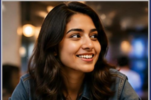
Aarohi Mehra
24 · Design student · Mumbai
"I spend more time choosing what to watch than
actually watching."
Motivation
Loves exploring new films across genres, often discovering
through reels, friends and online conversation.
Frustration
Too many options, generic recommendations, no place to
share opinions meaningfully.
Goal
Discover films that match her mood, find trustworthy
reviews, connect with similar taste.

Kabir Sharma
26 · Software engineer · Gurugram
"I trust my friend's recommendations more than
any platform."
Motivation
Watches regularly and is opinionated — follows film pages
and loves deep discussion.
Frustration
Hard to track viewing across platforms; reviews feel biased;
no community of like-minded film lovers.
Goal
Track what he watches, join real discussions, get
recommendations based on genuine preference.
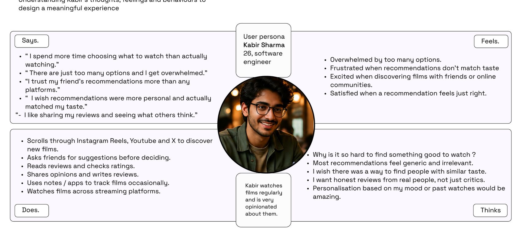
Empathy map — Kabir
Mapping what Kabir says, does, thinks and feels surfaced the emotional
stakes behind the feature list: decision fatigue, distrust of generic
recommendations, and a hunger for real community.
UX goals
Four goals translated research into design direction.
Reduce friction in onboarding and content access
Enable quick actions — log, review, save
Create a visually immersive yet minimal interface
Encourage interaction and participation
03
Ideate
Scoping the MVP, then mapping how every feature connects — the
architecture and flows behind the screens.
MVP scope
Goal: validate taste-based discovery paired with social interaction, built
around three pillars — utility, personalisation and community.
Taste-based onboarding — genres, directors, vibe
Feed — films, reviews and trends
Explore — search and curated discovery
Social — taste matching and hot takes
Lists — create and curate watchlists
Profile — track films and build an identity
Rooms — live film discussions
Gamification — badges, streaks, challenges
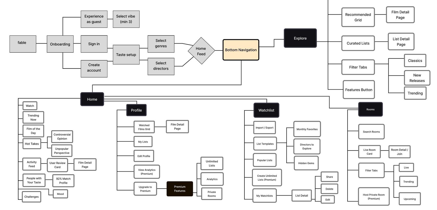
Information architecture
Every primary flow, home, explore, rooms, watchlists and profile, hangs off
one bottom navigation, so nothing needed is more than two taps away.
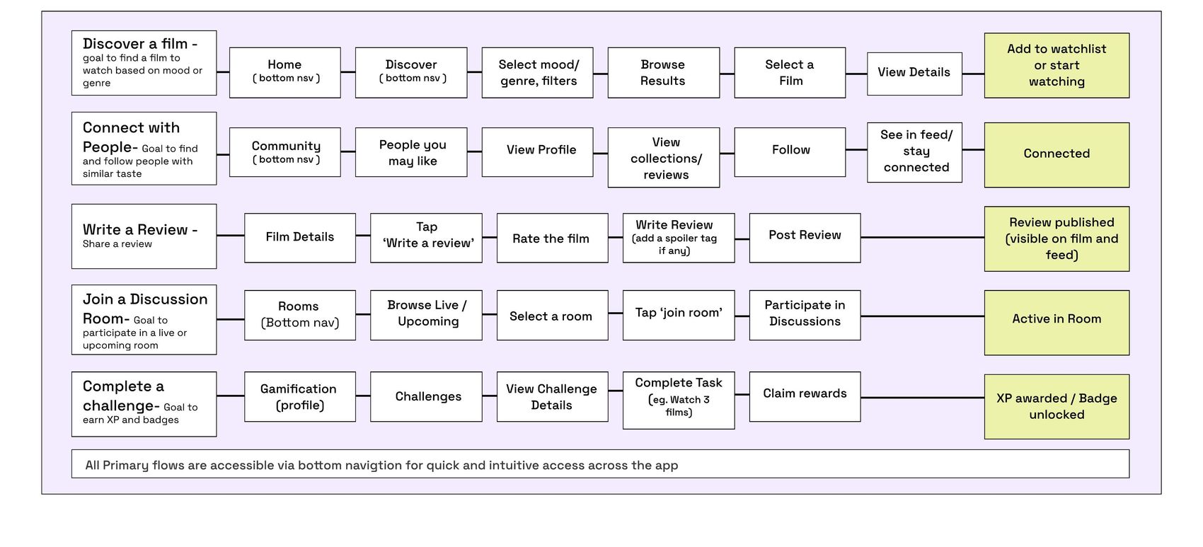
Core user flows
Five tasks mattered most: discovering a film, connecting with people, writing
a review, joining a room, and completing a challenge.
04
Design
From hand-drawn sketches to a working visual system, and the final screens that shipped.
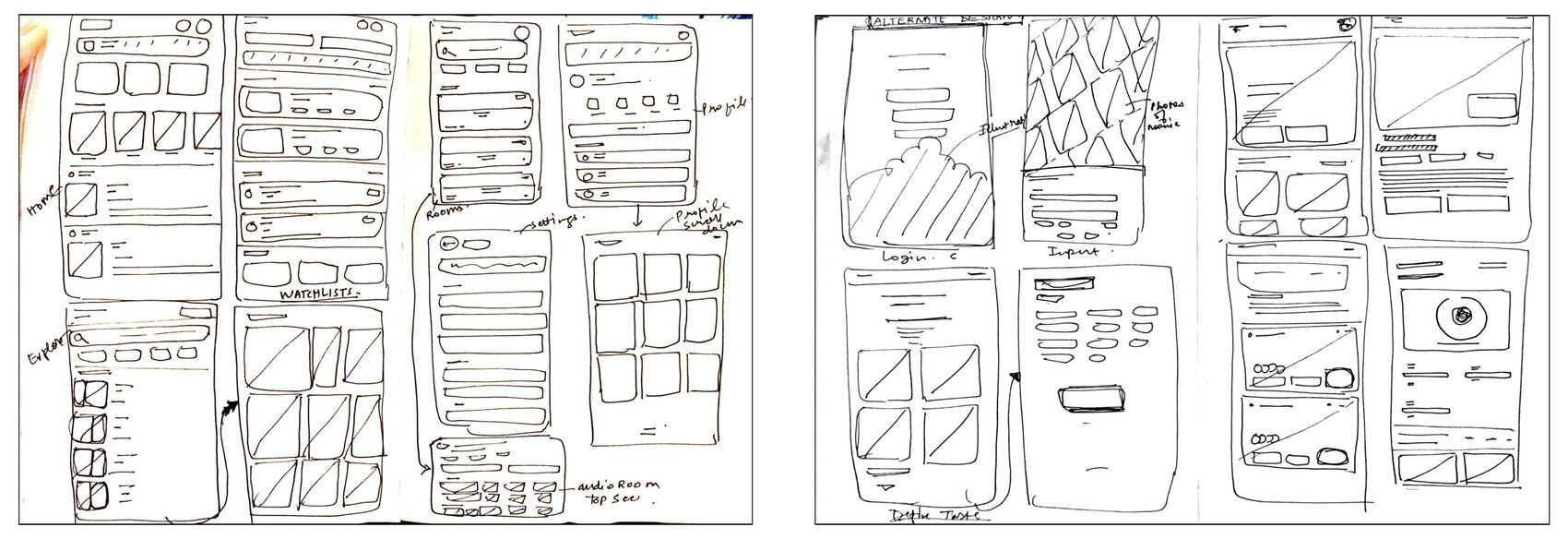
Sketching the structure
Rapid, hand-drawn iterations explored layout and navigation before anything was styled, the fastest way to test hierarchy without getting attached to
visuals too early.
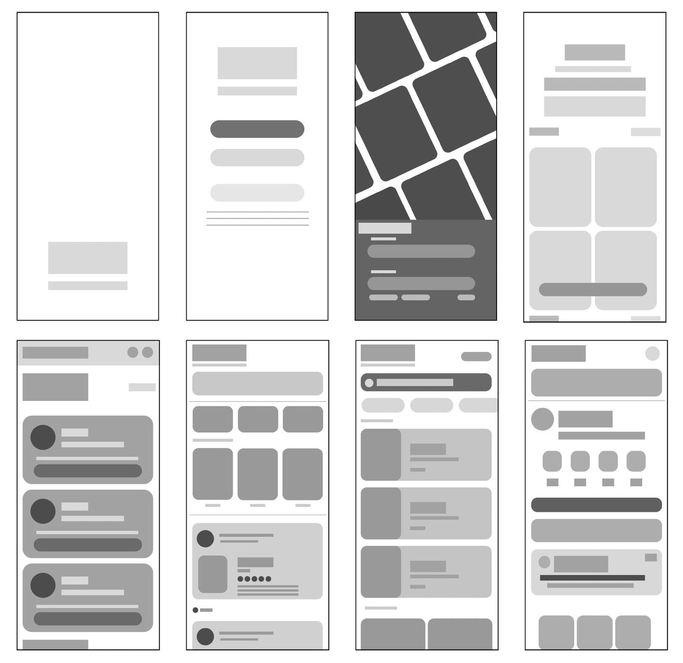
Low-fidelity wireframes
Once the structure held up, greyscale wireframes locked in hierarchy and
content placement across onboarding, feed, discovery, watchlists, rooms and
profile, before a single colour decision was made.
Visual identity
One typeface, Space Grotesk, carries headline, body and UI text. A confident primary blue anchors the interface, with teal, flame, purple, amber and pink
reserved for accents, moods and tags.
Aa
Space Grotesk — headline, body & buttons
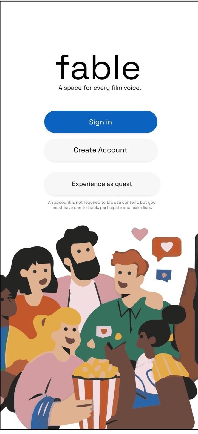
Final screens
Onboarding stays light, sign in, create an account, or explore as a guest,
before the feed brings mood, challenges and taste-matched people together
in one scroll.
Welcome
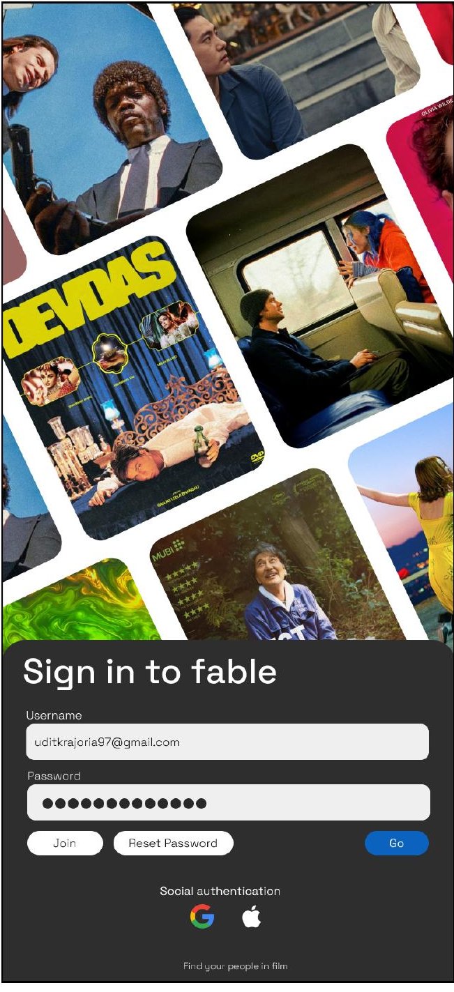
Sign in
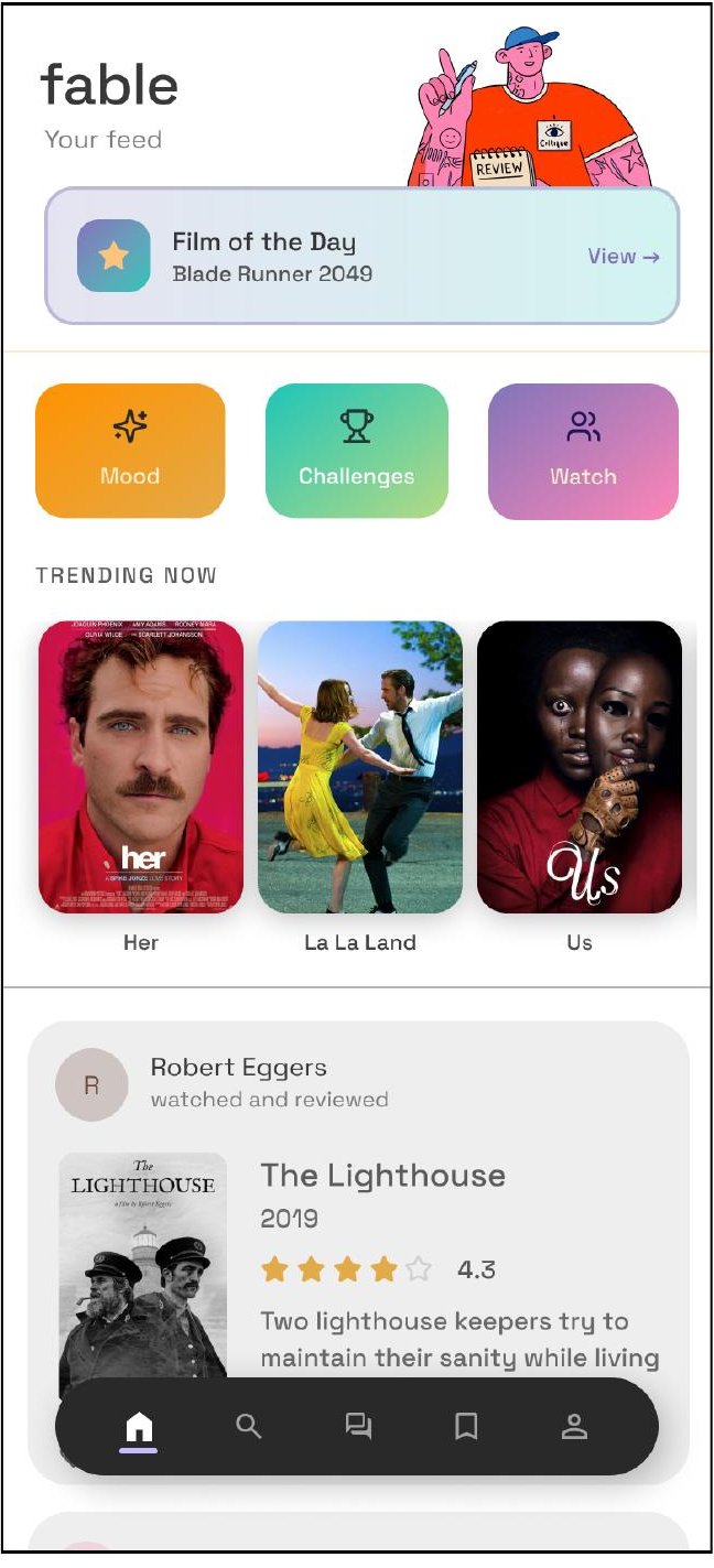
Home feed
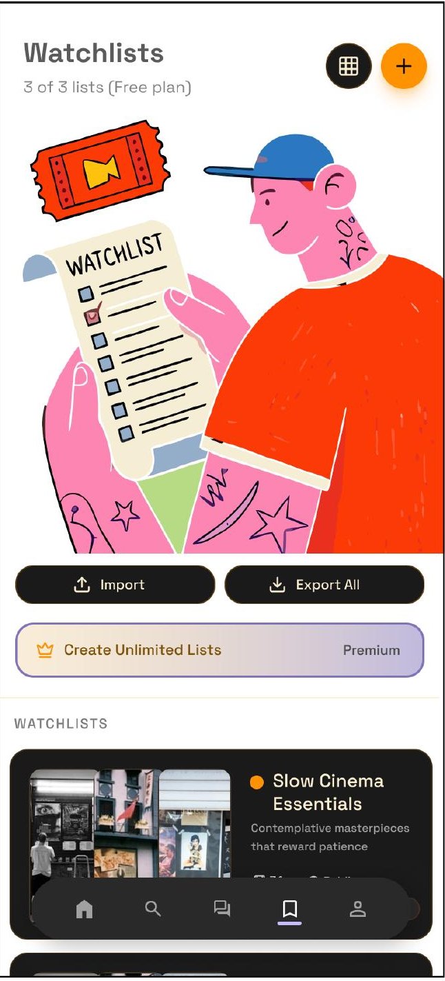
Watchlists
swipe

05
Deliver
How Fable sustains itself, the business model, the loop that keeps
people coming back, and the roadmap beyond MVP.
Monetisation
Free at the core, with revenue layered on top rather than in
front of it.
Premium subscription — ad-free, advanced
personalisation, private rooms
Non-intrusive, relevant advertising in feed and
discovery
Brand and OTT platform partnerships
Affiliate commission on tickets and merchandise
Gamification
Encouraging discovery and participation without turning
the app into a game.
Levels that grow with engagement and community
activity
Badges — "review master", "genre explorer", "binge
watcher"
Social rewards for inviting friends and starting
discussions
Streaks and challenges, like a 7-day movie streak
Product lifecycle
Fable is built to grow with its community — from a focused MVP to a self-
sustaining ecosystem.
Optimize
Sharpen personalisation,
gamification and content
quality with real data.
Sustain
A self-sustaining
ecosystem driven by
community, content and
value.
Launch
MVP with discovery,
profiles, watchlists, reviews
and community features.
Grow
Expand the user base,
refine recommendations,
strengthen engagement.
Expand
Introduce advanced
features, partnerships and
new content verticals.
06
Reflect
What changed, what got harder, and what carries into the next project.
Key learnings
User-centred design
Empathy and research
helped build features
people actually care
about.
Clear structure
A simple information
architecture made
discovery and
engagement effortless.
Iterate and validate
Early wireframes and
feedback shaped better
flows and decisions.
Community first
Designing for conversation
creates more value than
content alone.
Personal reflections
Research changed my thinking
I started with assumptions, but user responses showed me
gaps I hadn't considered.
Simple is harder than it looks
I over-designed at first, then had to step back and simplify the
flows.
Feedback was uncomfortable but useful
Early critiques pushed better decisions instead of sticking to
my first ideas.
I understand the UX process better now
From research to wireframes to final screens, the whole path
feels much clearer.
Thank you.
Fable was designed as an end-to-end case study, from a 28-person survey through to a working visual system. Get in touch
to talk through the process.
Fable — UI/UX Case Study · Udit Kumar
fable
UI/UX Case Study
A space for
every film voice.
Fable is a mobile app concept that turns film-watching
into a personal, social and expressive experience,
designed end to end, from research through to final
screens.
Designer
Udit Kumar
Role
End-to-end UX/UI
Platform
Mobile app
Timeline
Research → Final UI
01
Discover
Understanding why film lovers feel underserved by the platforms built
for them.
The problem with how we watch
Cinema is highly accessible, yet structurally
fragmented.
People now watch films across a dozen apps and platforms, but none of them
give film lovers one place to track what they've seen, discover something
worth their time, say what they actually think, and find people who share
their taste.
Track what they watch
Discover meaningful content
Express opinions
Connect with like-minded viewers
Research goals
Before designing anything, three questions shaped the research plan.
Discovery habits
How do people actually find films and
decide what to watch?
Existing gaps
Where do IMDB, streaming apps and social
platforms fall short?
Social & identity
What role do taste and community play in
how people engage?
What 28 respondents told us
A short survey on discovery habits, frustrations and appetite for a taste-
driven, social film app.
82%
watch films at least once
a week
89%
discover films through
social media
86%
enjoy sharing opinions or
reviews
93%
want to connect with
similar taste
82%
want recommendations
based on personal taste
Primary research insights
Users prefer clean, simple, intuitive interfaces over
feature-dense ones.
There's a strong, recurring need to track watched
films and build lists.
People want to share opinions and find viewers with
similar taste.
Mood and vibe, not just genre, drive what people
choose to watch.
Secondary research
Information overload makes discovery difficult.
Schwartz, 2004
Users trust peer opinions more than algorithms.
Hennig-Thurau et al., 2004
Personalised recommendations improve engagement.
Aggarwal, 2016
Presentation and interface design shape the whole
experience.
Knijnenburg et al., 2012
Key conclusion: users need a platform that combines discovery, personal identity and social interaction in one place — which became the three pillars behind Fable.
02
Define
Turning research into a clear problem statement, two real user types,
and the goals that would guide every design decision.
Problem statement
Users who actively engage with films lack a
platform that lets them track, discover and
express their cinematic perspective — without
cluttered interfaces or superficial interactions.
That gap is exactly where personalisation and community-driven discovery
could meet.
Meet the users
Two personas anchored every decision that followed, a discovery-led
explorer, and an opinionated cinephile who wants real conversation.
Aarohi Mehra
24 · Design student · Mumbai
"I spend more time choosing what to watch than
actually watching."
Motivation
Loves exploring new films across genres, often discovering
through reels, friends and online conversation.
Frustration
Too many options, generic recommendations, no place to
share opinions meaningfully.
Goal
Discover films that match her mood, find trustworthy
reviews, connect with similar taste.
Kabir Sharma
26 · Software engineer · Gurugram
"I trust my friend's recommendations more than
any platform."
Motivation
Watches regularly and is opinionated — follows film pages
and loves deep discussion.
Frustration
Hard to track viewing across platforms; reviews feel biased;
no community of like-minded film lovers.
Goal
Track what he watches, join real discussions, get
recommendations based on genuine preference.
Empathy map — Kabir
Mapping what Kabir says, does, thinks and feels surfaced the emotional
stakes behind the feature list: decision fatigue, distrust of generic
recommendations, and a hunger for real community.
UX goals
Four goals translated research into design direction.
Reduce friction in onboarding and content access
Enable quick actions — log, review, save
Create a visually immersive yet minimal interface
Encourage interaction and participation
03
Ideate
Scoping the MVP, then mapping how every feature connects — the
architecture and flows behind the screens.
MVP scope
Goal: validate taste-based discovery paired with social interaction, built
around three pillars — utility, personalisation and community.
Taste-based onboarding — genres, directors, vibe
Feed — films, reviews and trends
Explore — search and curated discovery
Social — taste matching and hot takes
Profile — track films and build an identity
Lists — create and curate watchlists
Rooms — live film discussions
Gamification — badges, streaks, challenges
Information architecture
Every primary flow — home, explore, rooms, watchlists and profile — hangs off
one bottom navigation, so nothing needed is more than two taps away.
Core user flows
Five tasks mattered most: discovering a film, connecting with people, writing
a review, joining a room, and completing a challenge.
04
Design
From hand-drawn sketches to a working visual system, and the final
screens that shipped.
Sketching the structure
Rapid, hand-drawn iterations explored layout and navigation before anything
was styled — the fastest way to test hierarchy without getting attached to
visuals too early.
Low-fidelity wireframes
Once the structure held up, greyscale wireframes locked in hierarchy and
content placement across onboarding, feed, discovery, watchlists, rooms and
profile — before a single color decision was made.
Visual identity
One typeface, Space Grotesk, carries headline, body and UI text. A confident
primary blue anchors the interface, with teal, flame, purple, amber and pink
reserved for accents, moods and tags.
Primary — 0C62BF
Teal — 1EC5B9
Flame — FD3D08
Charcoal — 2E2E2E
Purple — 8174BB
Amber — FF9200
Pink — FD85B2
Ink — 12102B
Aa
Space Grotesk — headline, body & buttons
Final screens
Onboarding stays light — sign in, create an account, or explore as a guest —
before the feed brings mood, challenges and taste-matched people together
in one scroll.
Welcome
Sign in
Home feed
Watchlists
05
Deliver
How Fable sustains itself — the business model, the loop that keeps
people coming back, and the roadmap beyond MVP.
Monetisation
Free at the core, with revenue layered on top rather than in
front of it.
Premium subscription — ad-free, advanced
personalisation, private rooms
Non-intrusive, relevant advertising in feed and
discovery
Brand and OTT platform partnerships
Affiliate commission on tickets and merchandise
Gamification
Encouraging discovery and participation without turning
the app into a game.
Levels that grow with engagement and community
activity
Badges — "review master", "genre explorer", "binge
watcher"
Social rewards for inviting friends and starting
discussions
Streaks and challenges, like a 7-day movie streak
Product lifecycle
Fable is built to grow with its community — from a focused MVP to a self-
sustaining ecosystem.
Launch
MVP with discovery,
profiles, watchlists, reviews
and community features.
Grow
Expand the user base,
refine recommendations,
strengthen engagement.
Optimize
Sharpen personalisation,
gamification and content
quality with real data.
Expand
Introduce advanced
features, partnerships and
new content verticals.
Sustain
A self-sustaining
ecosystem driven by
community, content and
value.
06
Reflect
What changed, what got harder, and what carries into the next project.
Key learnings
User-centred design
Empathy and research
helped build features
people actually care
about.
Clear structure
A simple information
architecture made
discovery and
engagement effortless.
Iterate and validate
Early wireframes and
feedback shaped better
flows and decisions.
Community first
Designing for conversation
creates more value than
content alone.
Personal reflections
Research changed my thinking
I started with assumptions, but user responses showed me
gaps I hadn't considered.
Simple is harder than it looks
I over-designed at first, then had to step back and simplify the
flows.
Feedback was uncomfortable but useful
Early critiques pushed better decisions instead of sticking to
my first ideas.
I understand the UX process better now
From research to wireframes to final screens, the whole path
feels much clearer.
Thank you.
Fable was designed as an end-to-end case study — from a 28-
person survey through to a working visual system. Get in touch
to talk through the process.
Fable — UI/UX Case Study · Udit Kumar